
The New Official Logo of
Kaduna South Local Government
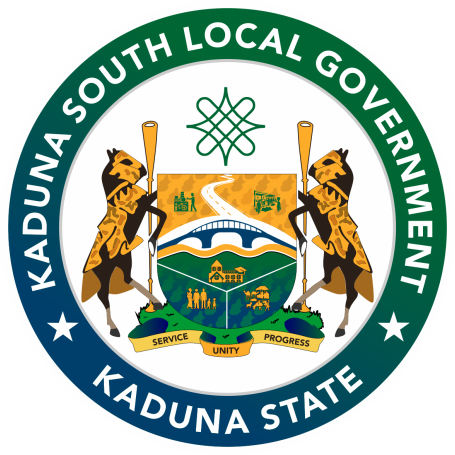
Symbolizing our rich heritage, unity, and forward-looking aspirations. Guided by the motto: "Service, Unity, Progress".
Introduction
Under the visionary leadership of Hon. Rayyan Hussein, Executive Chairman of Kaduna South Local Government, a new official logo has been developed to symbolize the area's rich heritage, unity, and forward-looking aspirations. This emblem represents a significant milestone in the administration's commitment to innovative governance, cultural preservation, and community development.
Designed in January 2026 by Abdullahi Abubakar Ladan, a renowned Specialist Visual Designer and the Special Assistant on Digital Communications to the Executive Chairman since August 2025, the logo encapsulates the essence of Kaduna South LG as a vibrant, diverse, and progressive entity.
The introduction of this new logo aligns with the administration's broader goals of enhancing local identity, promoting transparency, and fostering inclusivity. It serves as a visual cornerstone for all official communications, reflecting the motto "Service, Unity, Progress".
Historical Context
Kaduna South Local Government, located in the heart of Kaduna State, has long been a hub of commercial, cultural, and industrial activities. Prior to this update, the area's branding evolved to meet changing needs, but the brand new logo marks a fresh chapter under Hon. Rayyan Hussein's tenure.
This is the very first time the local government is having its own unified, official logo.
The design process was collaborative and meticulous, drawing inspiration from the region's geography, history, and people. Abdullahi Abubakar Ladan incorporated feedback from stakeholders to ensure the logo resonates with residents. Completed in January 2026, it was crafted to be timeless yet modern, suitable for digital platforms, print materials, and public displays.
Symbolism & Elements
The logo is a circular emblem featuring a central shield supported by two stylized horses holding oars, symbolizing strength and navigation through challenges.
Northern Nigeria Symbol
Represents the LG's position in Northern Nigeria, highlighting its regional significance and interconnectedness.
Western Bye Pass
Depicts the Nnamdi Azikiwe road connecting Kaduna South to Northern Nigeria, symbolizing connectivity and progress.
Industries & Panteka
Illustrates the bustling industries and markets in Kaduna South, emphasizing our unmatched economic vitality.
River Kaduna & Bridge
Waves representing the river denoting life, sustenance, and the iconic bridge serving as a key infrastructural landmark.
Diversity & Harmony
Male and female figures of different faiths and tribes united, reflecting the LG's commitment to social cohesion.
Zango Cattle Market
Animals and market scenes representing the international cattle market, a massive cornerstone of the local economy.
Institutions, Traditions & Map
Federal and state buildings depicting government presence, alongside a branched element for our three constituencies. The outline of Kaduna South LG grounds the design geographically, while traditional figures evoke our rich cultural heritage and independence.
Official Color Scheme
A purposeful palette drawn from the natural and cultural elements of Kaduna South.
Deep Forest Green
#006633
Symbolizes growth, agriculture, and our lush landscapes.
Medium Blue
#0000FF
Represents the River Kaduna and administrative stability.
Coffee Brown
#4F2F13
Evokes the earth's richness and traditional heritage.
Golden Yellow
#FFD700
Signifies prosperity, boundless energy, and the sun.
Yellow Orange
#FFCC33
Adds vibrancy, representing innovation and community spirit.
Pure White
#FFFFFF
Stands for purity, enduring peace, and unity.
Hon. Rayyan Hussein
Executive Chairman
Hon. Rayyan Hussein has been instrumental in driving this initiative. His administration focuses on youth empowerment, community development, and transparent governance. The new logo is a testament to his dedication to building a stronger, united Kaduna South.
Abdullahi A. Ladan
Special Assistant, Digital Communications
A distinguished Specialist Visual Designer with over 12 years of experience. Born and raised in Sabon Gari North, he is a prominent figure in ICT. His design philosophy emphasizes inclusivity, cultural relevance, and modern aesthetics, making him the ideal creator for this emblematic project.
Usage Guidelines & Assets
To maintain brand integrity, the logo should be used in its full color version on white or light backgrounds. Monochrome adaptations are available for specific applications.